

Trans-Atlantic Preforms
BRAND DESIGN
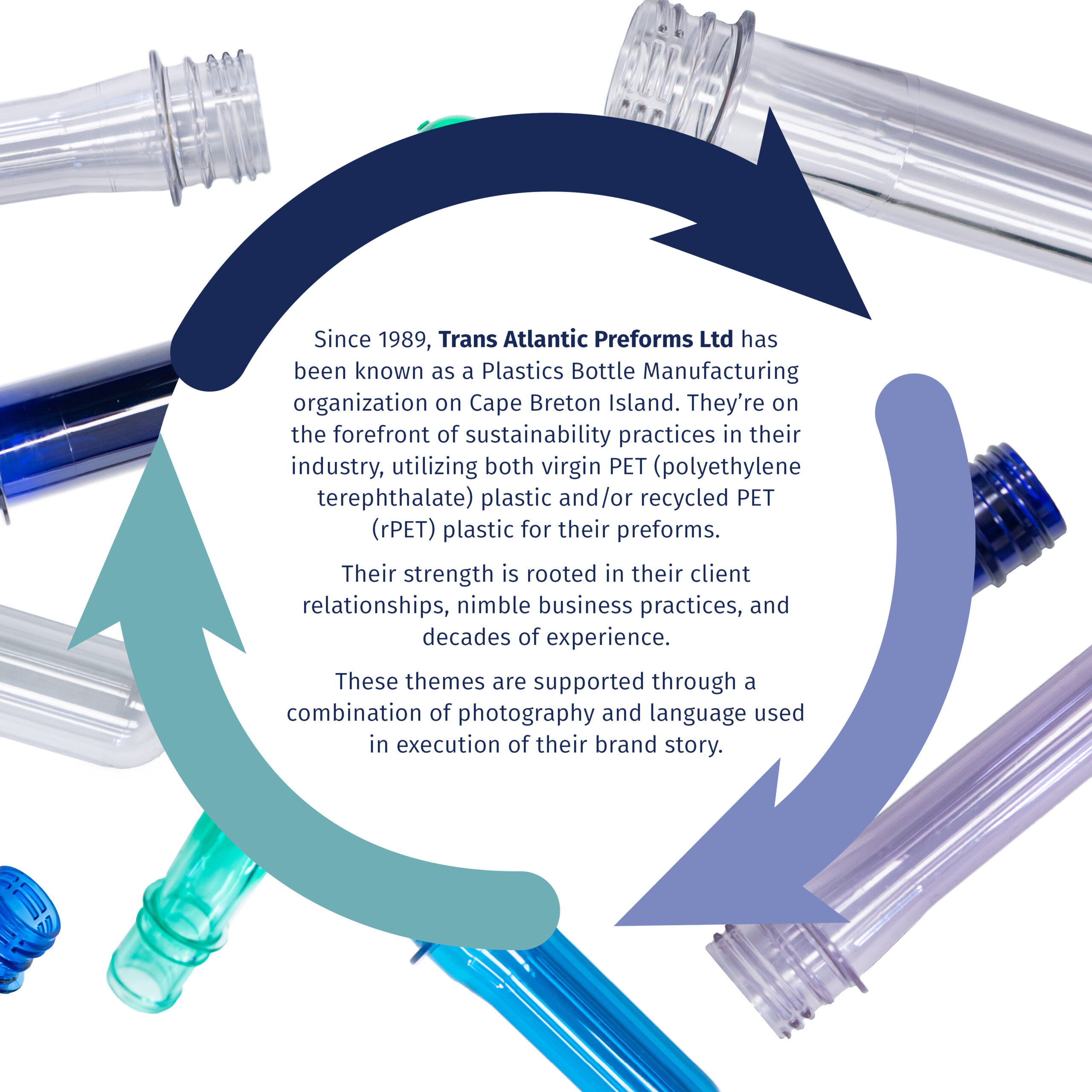
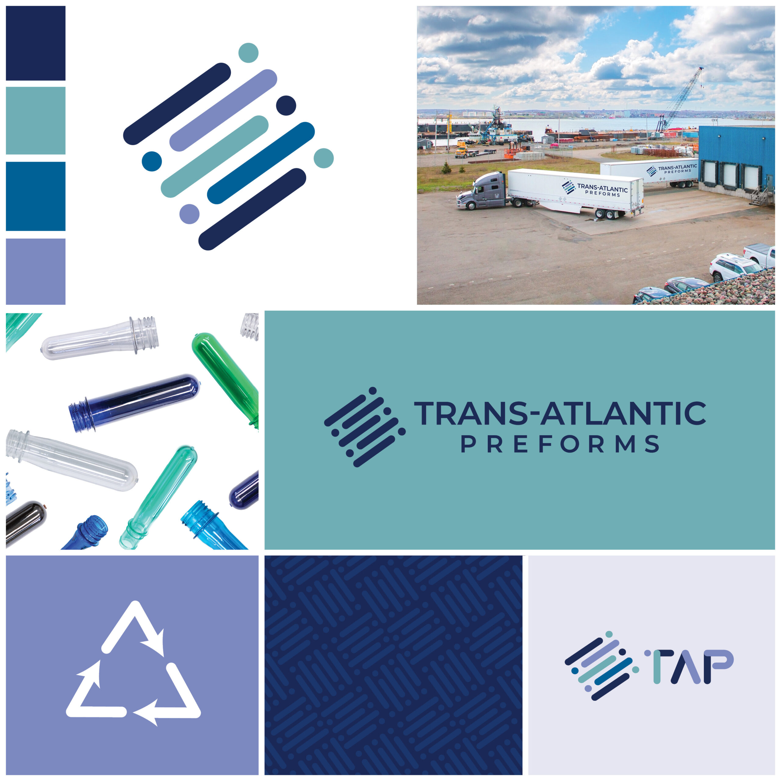
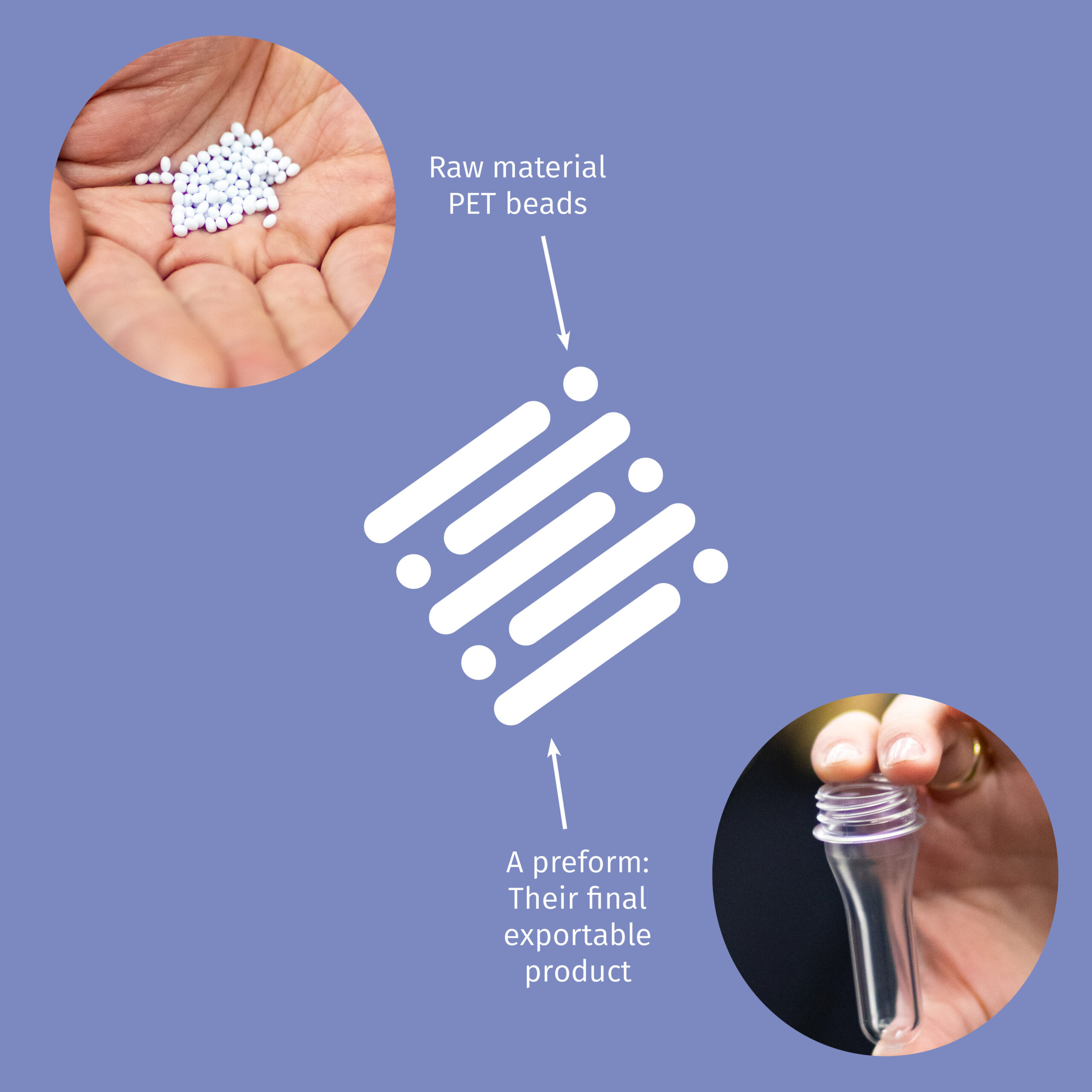
Leaders of sustainability in their industry, Trans-Atlantic Preforms taught us a lot about the manufacturing of plastic bottles!
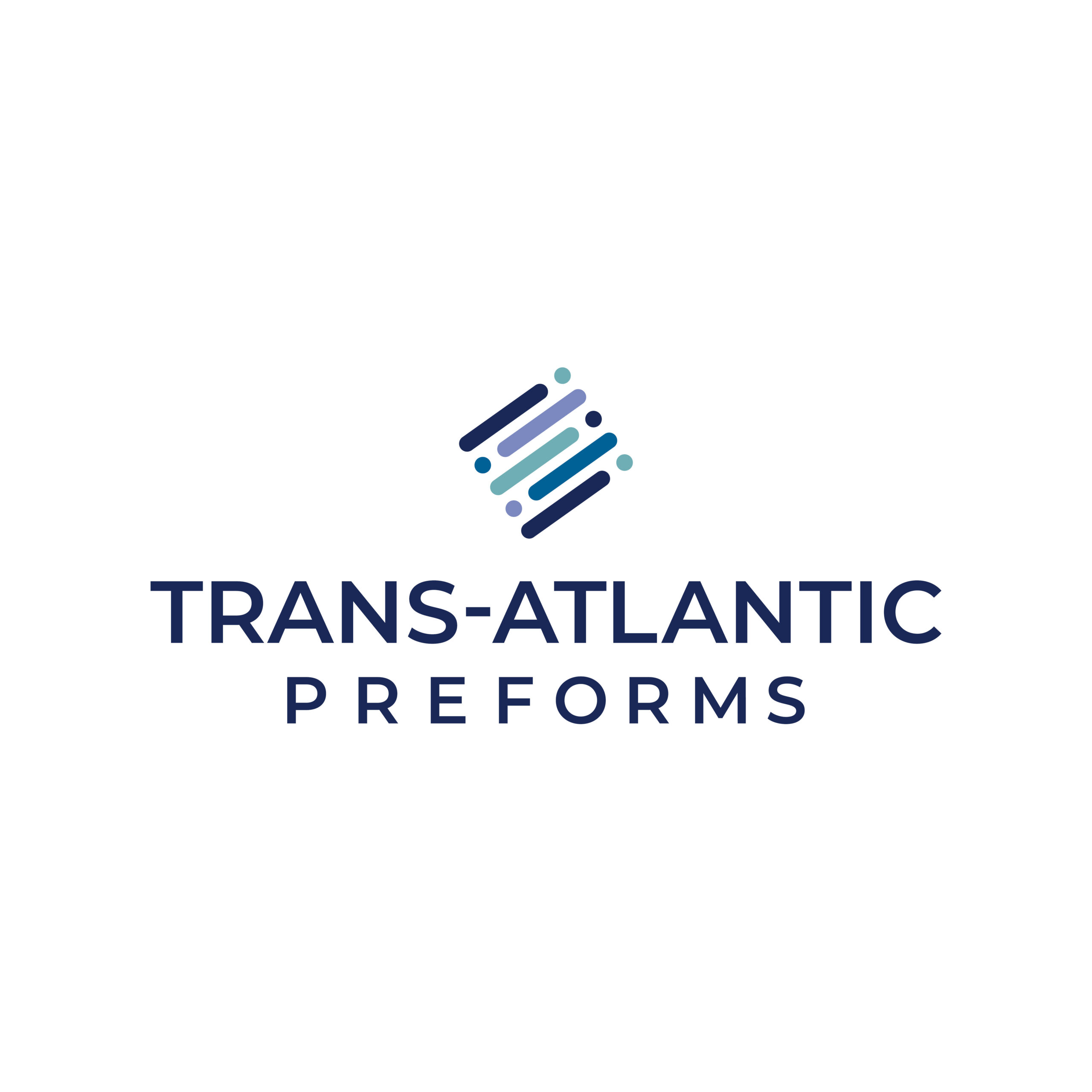
This project kicked off with a brand update! With this brand Jayme created various logos to allow flexibility with print, clothing, and design uses. The main icon features tube and dot shapes to represent the preforms and PETmaterial the company utilizes. The colour palette pulls from some of the colourways of the end products but in muted, professional tones that also honour the company’s previous brand, and the company’s ties to the Pepsi Co. brand. Paired with a sans serif, this logo is modern and friendly, and is sure to grow with the company in the future.
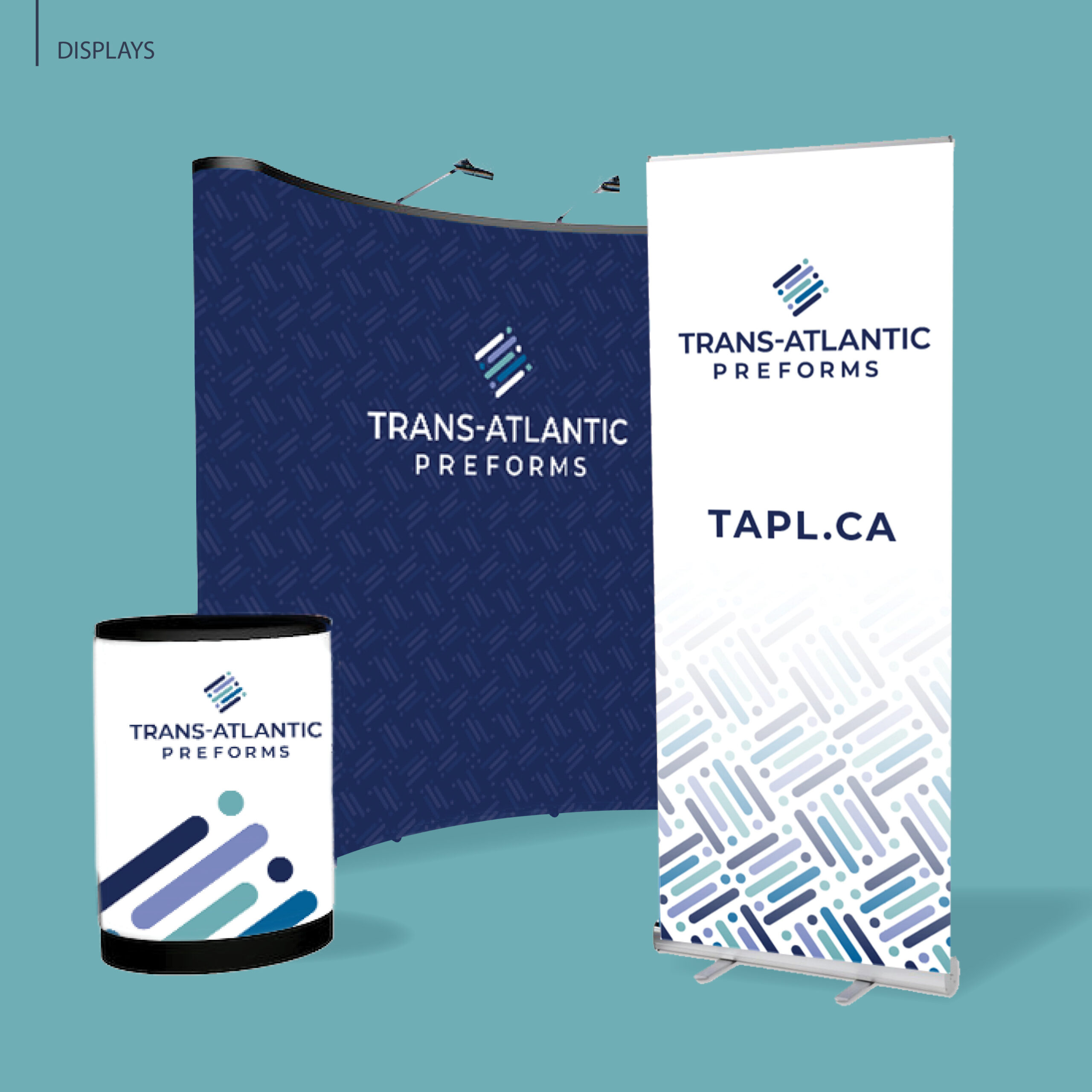
With a new brand came updated photography, where we were everywhere from the assembly line to the roof. After that came a newly designed website, and to wrap it all up digital and print marketing materials. Our favourite being the brand new display from City Print + to be used at conventions!
Date:
February 11, 2025