Breton Ability
BRAND DESIGN
It’s always such a pleasure working with organizations to create a new brand to represent big changes and new directions. In line with their new strategic plan, Breton Ability came to us looking for a brand refresh.
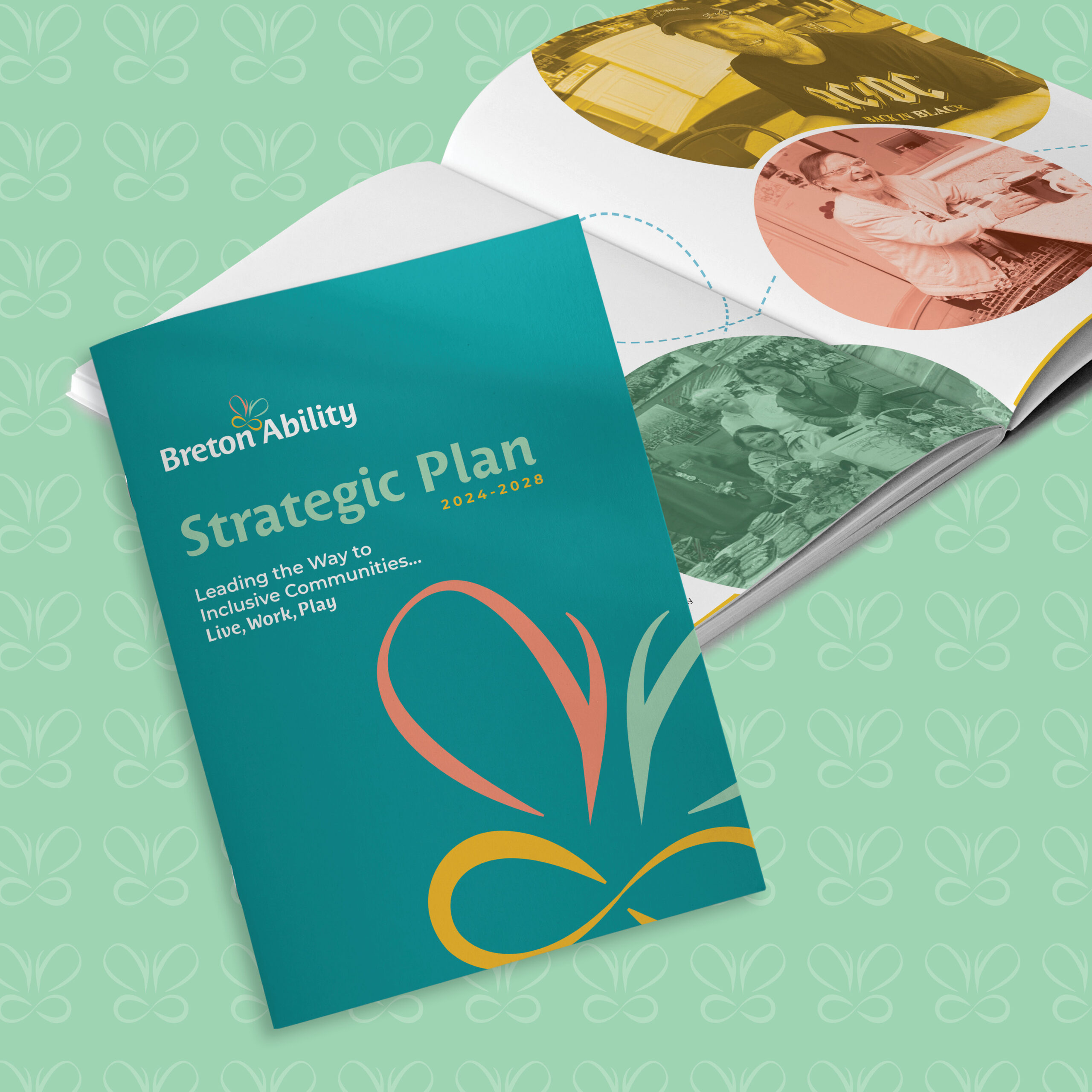
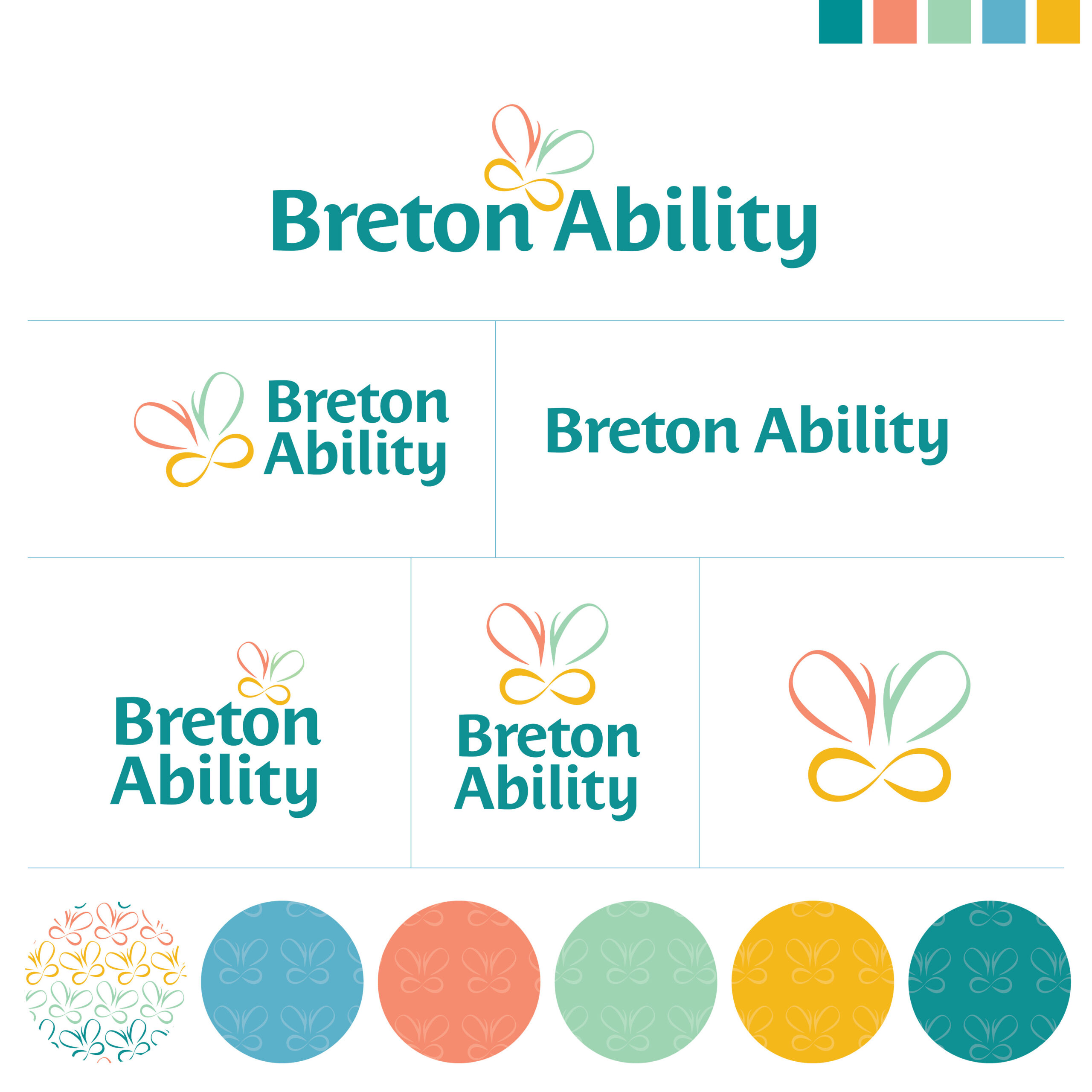
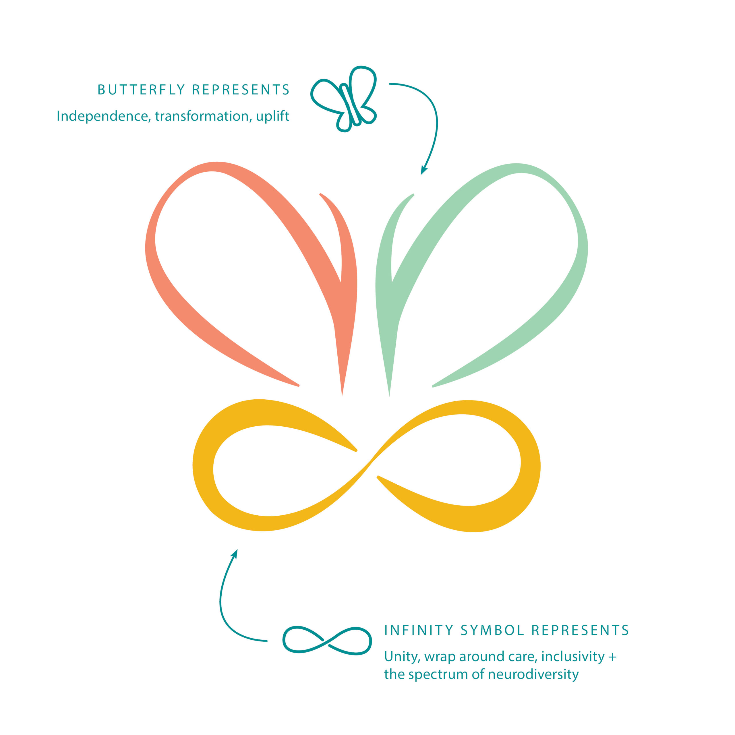
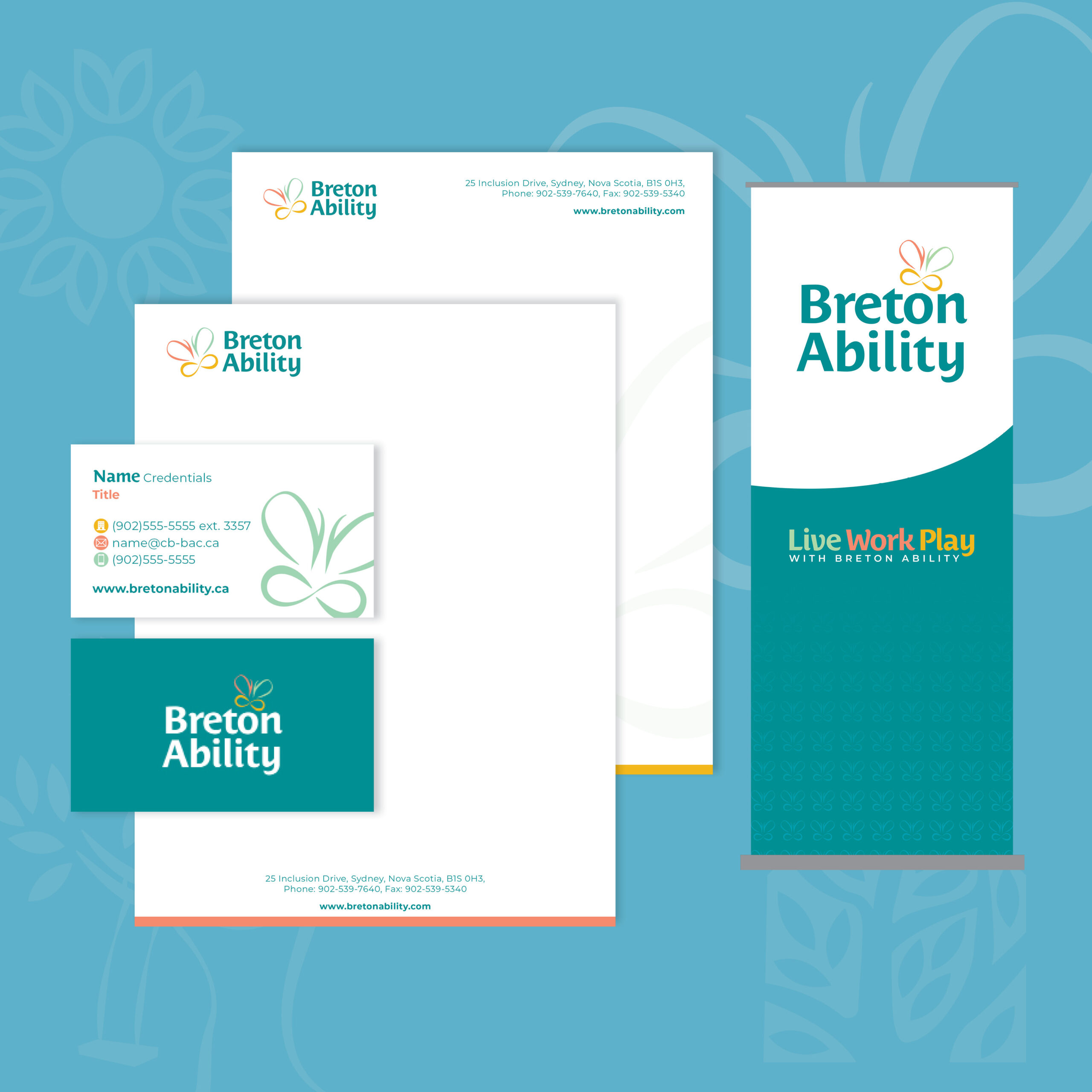
Following a series of staff and stakeholder consultations, Jayme created a brand that speaks to the collective vision of the organization. The main logo features a butterfly in motion, with its lower wings forming an infinity symbol. This design symbolizes the organization’s dedication to working with individuals with varying abilities, representing both inclusivity and acceptance for those they serve. The butterfly’s dynamic movement is paired with a cheerful, modern font, reflecting the organization’s shift towards empowering clients to gain independence and enhance their quality of life within the community.
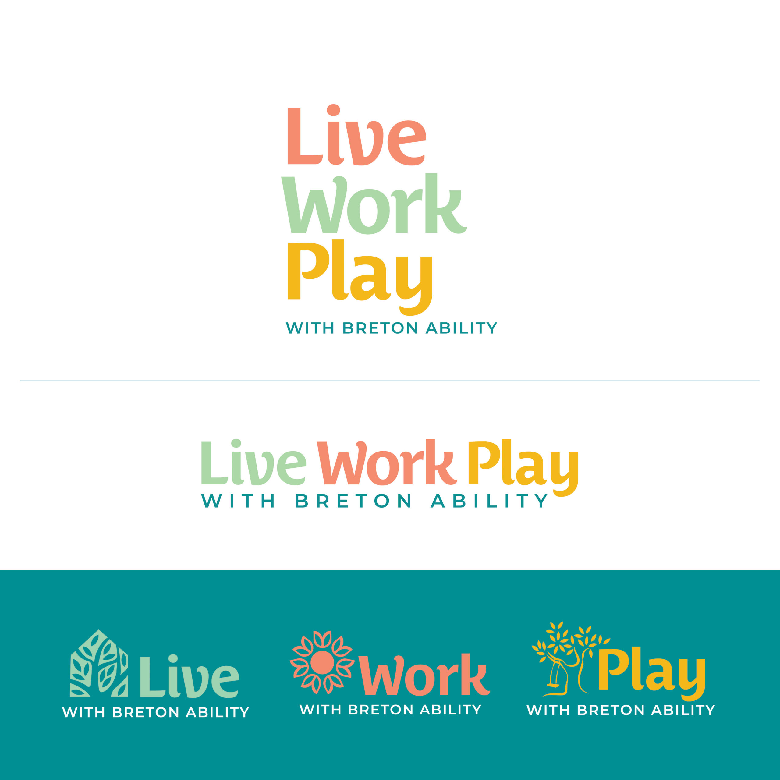
This brand also has a secondary logo set to represent the individual pillars of Live, Work, Play. They each have their own colour identifier and icons to build strong visual connections.
To complete the brand, Jayme created a variety of patterns, to be used to add texture to social graphics, print materials, and on the website.
Our ongoing partnership with Breton Ability is one we are extremely proud of, and we can’t wait to see where their future is heading!
Date:
February 11, 2025