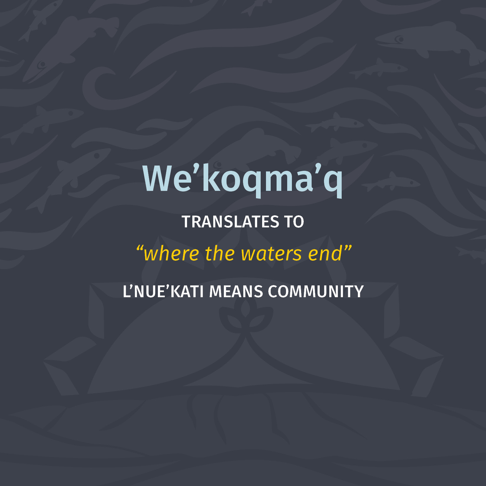

We’koqma’q
COMMUNITY BRAND DESIGN
This is one of our favourite projects of 2022 as it challenged us, pushed us to think outside of the box and made us fall even more in love with the community of We’koqma’q. For this project, we were very honoured to have partnered creative firm, Patuo’kn of We’koqma’q to help bring the community’s vision and brand to life.
We first started talking to the community of We’koqma’q a few years ago about the idea of creating a new visual identity for their community. We’koqma’q is truly a community on the rise. Their mission is simple: To improve the overall quality of life and well-being of all community members. Over the past decade, they’ve transformed the way their community operates and have made notable progress towards this mission, especially in the areas of education, health, economy and social support.
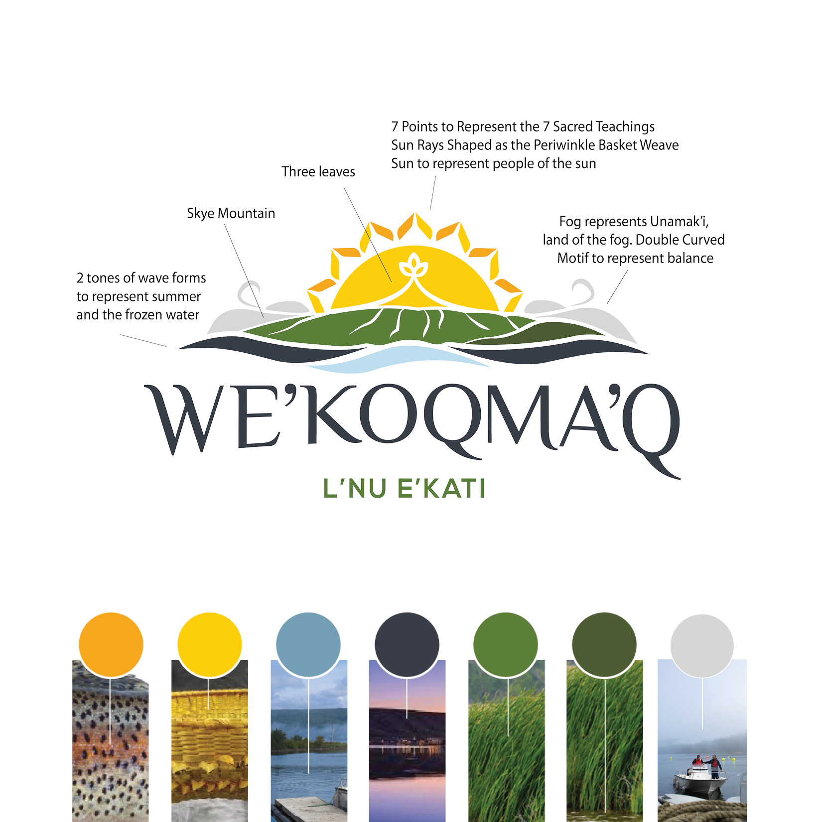
The goal of this branding project was to ensure that everyone felt included and welcomed to participate in feedback. It was critical that this brand embodied the community and evoked pride of place. To achieve this, the process started with a series of engagement sessions with over 100 community members including Elders, Youth, Community members, Special Advisory, and Chief and Council. Some of the themes that arose from these sessions were balance, pride, welcoming and resilience. Common imagery included the landscape (mountains, water, and ice), the sun, traditions (7 Sacred Teachings), art (Basket Weaving), animals, and traditional medicine (swamp grass and golden thread).
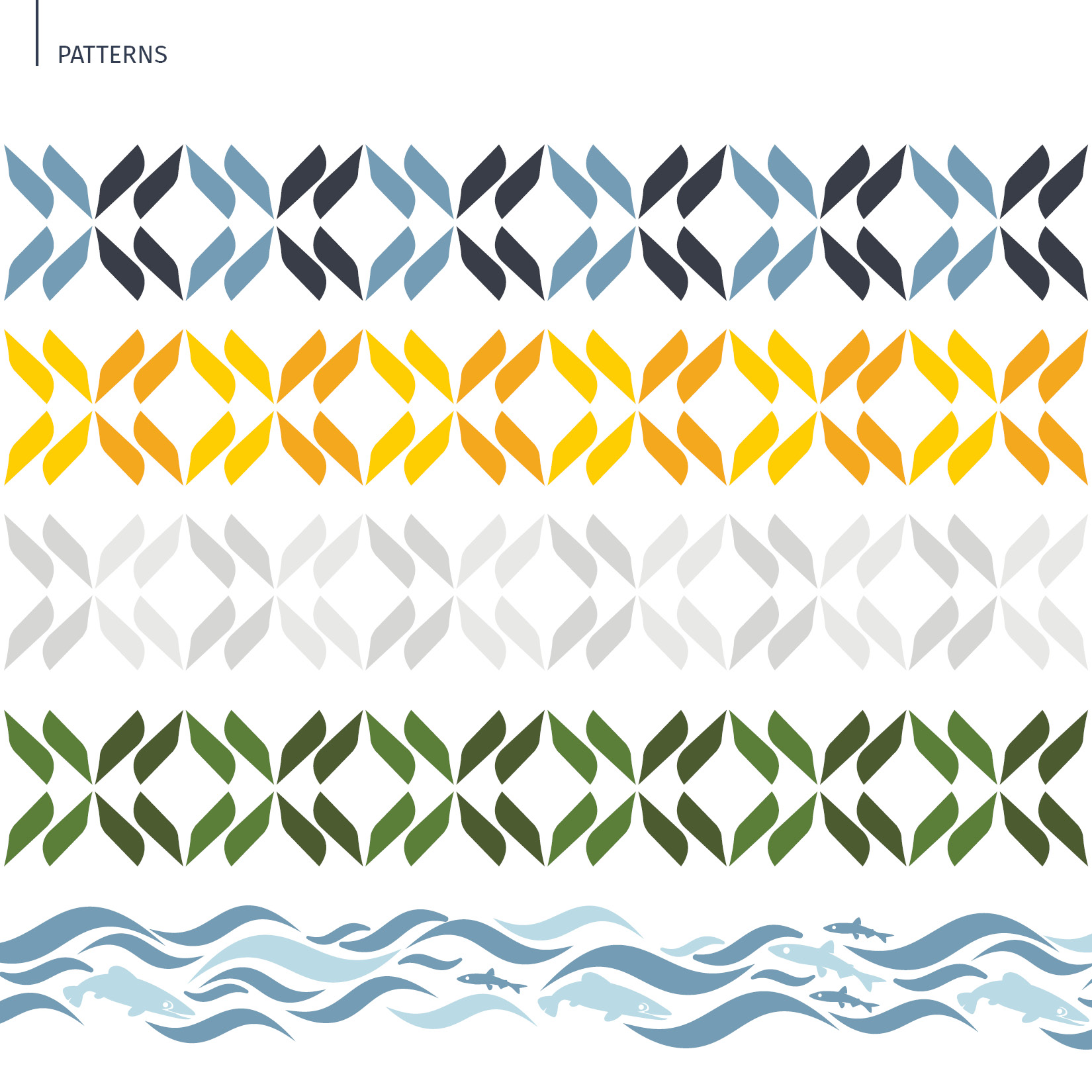
Using the themes from the engagement sessions, our creative team designed a colour palette that consisted of a range of natural tones, found in We’koqma’q. From the stripes on the steelhead trout, to the fog that blankets the mountains, all of the colours of this brand can be found throughout the stunning community of We’koqma’q.
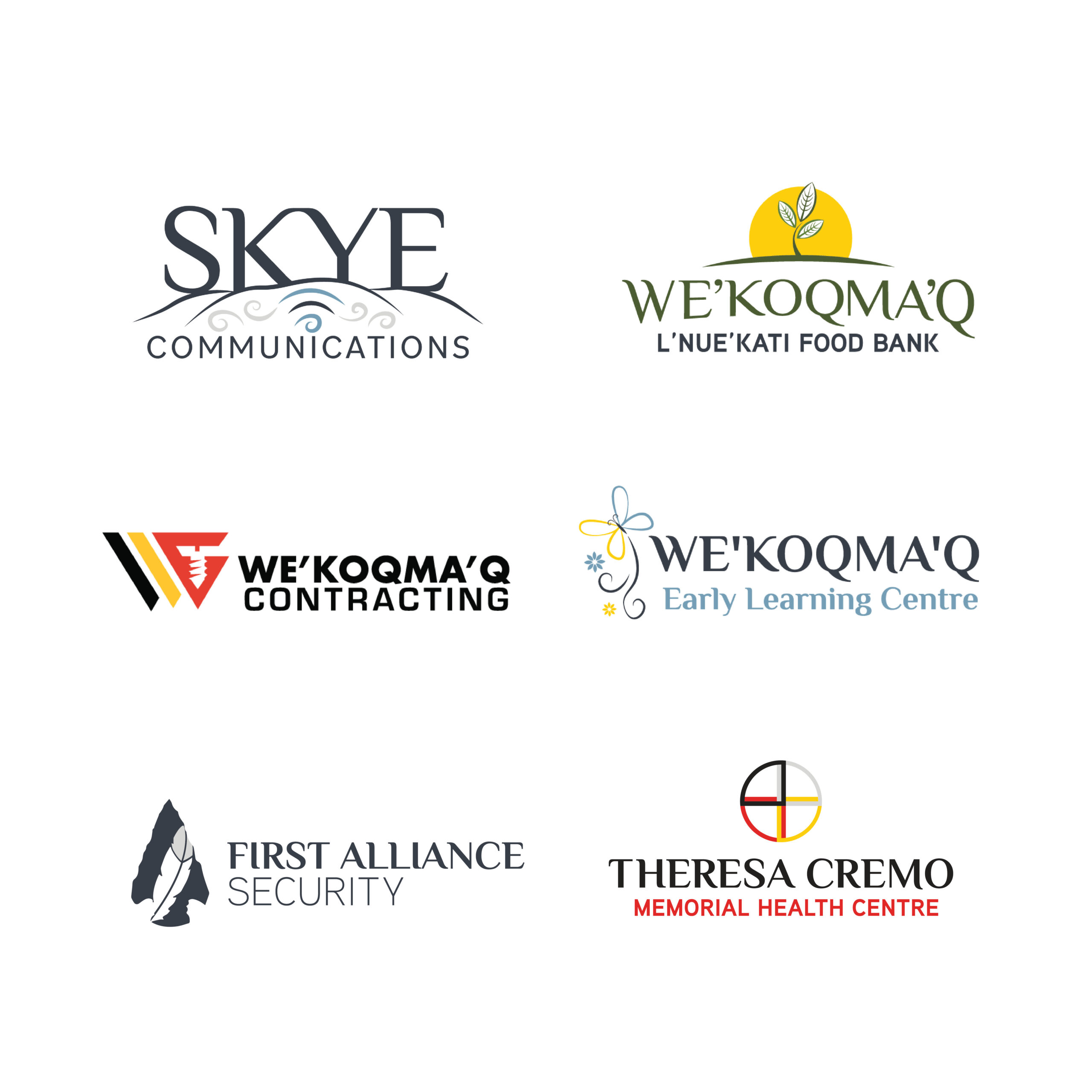
Over the course of 6 months Jayme worked with Patuo’kn, an illustration and design team from We’koqma’q. Founded by Kassidy and Kaylyn, they brought with them not only community knowledge, but years of experience in sharing cultural awareness through visuals; with cultural revitalization and preservation at the forefront. Together, we created a logo that the community can be proud of, and see themselves in for generations to come.
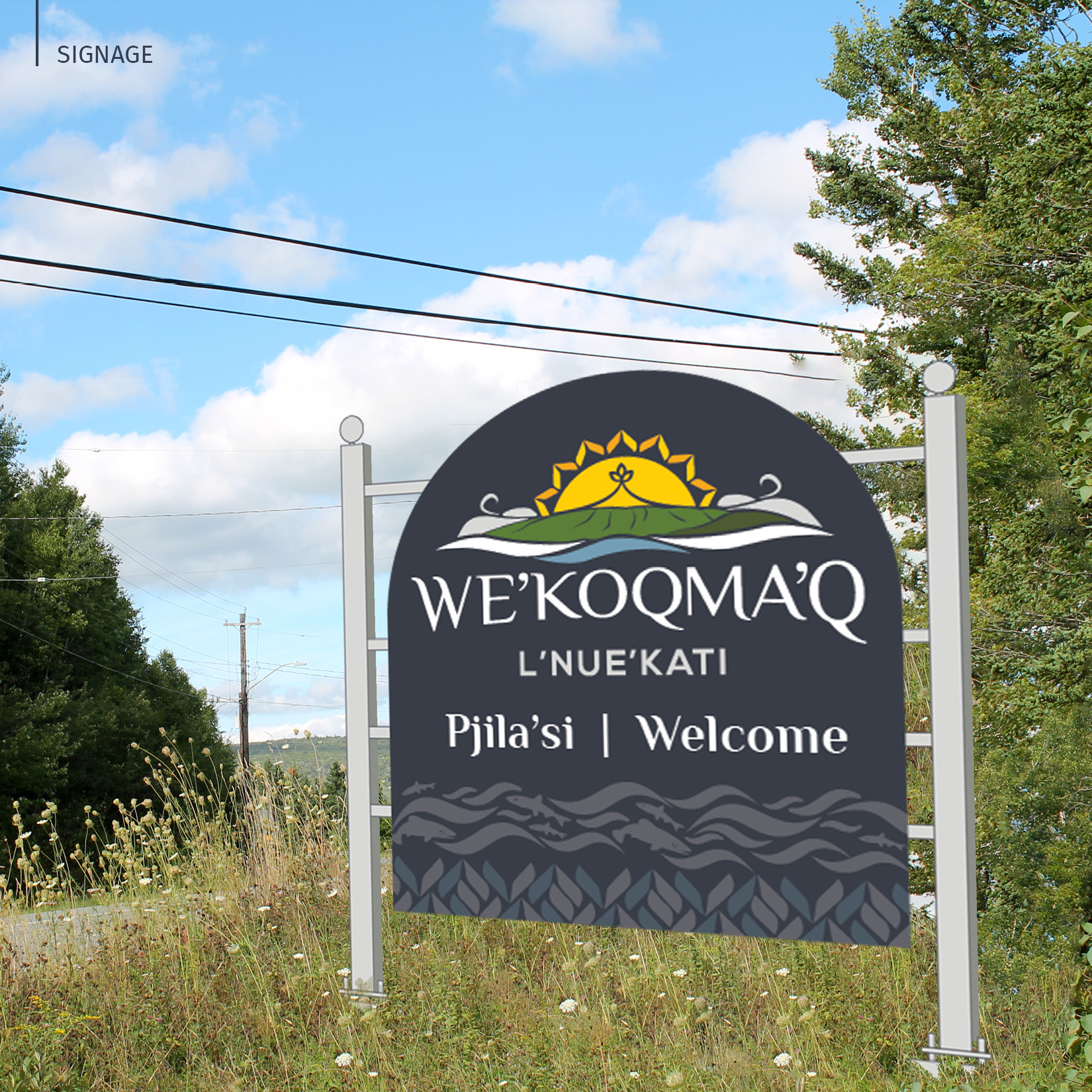
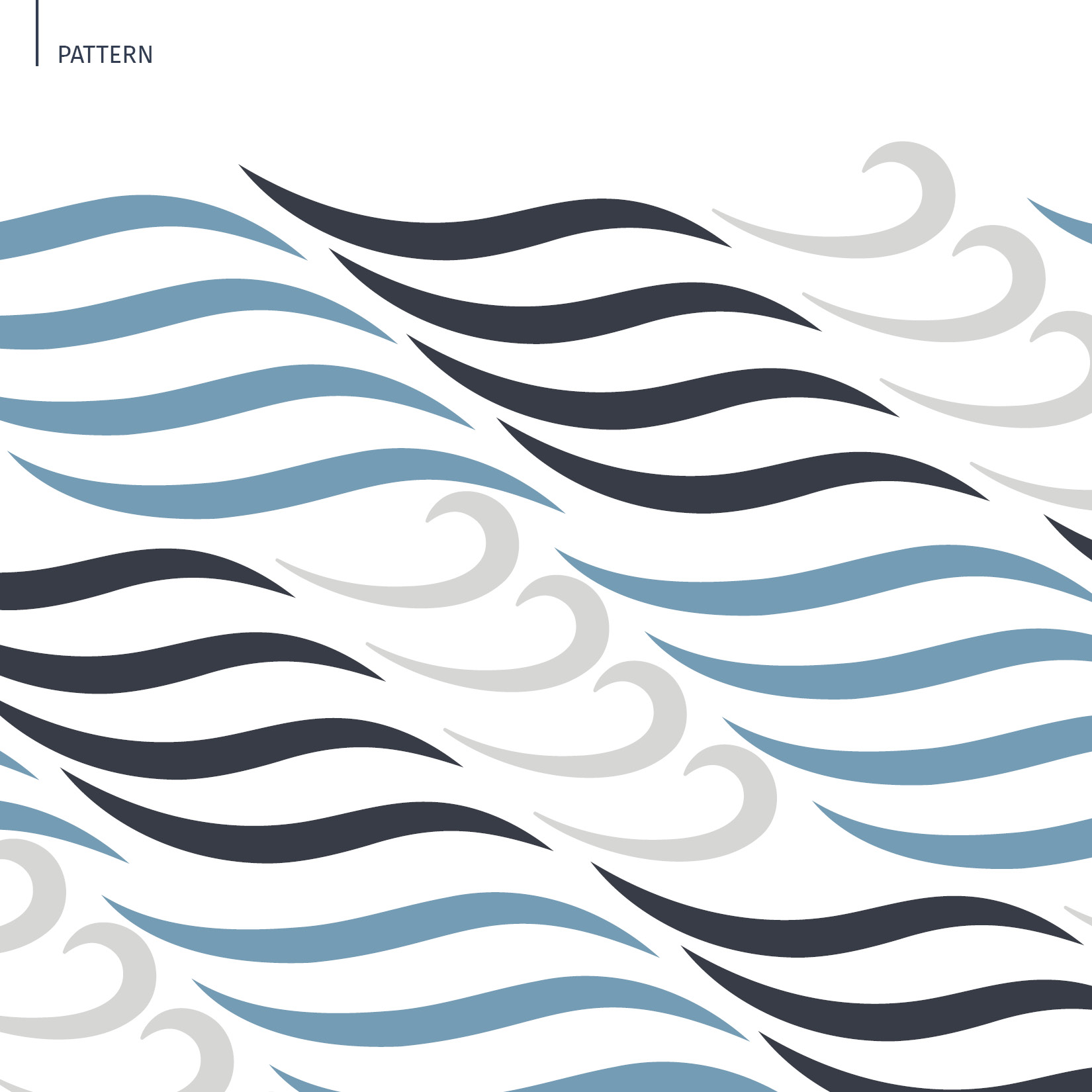
The main logo for the brand features a sun rising behind the Skye Mountain, which is an important part of the community’s landscape. The sun consists of a periwinkle basket weave for the sun ray, and a trefoil leaf motif which is prevalent in Mi’kmaw art. The sun is framed by billowing clouds representing fog, a nod to the land of the fog (Unamak’i) and double curve motif. The two tone waves represent ice and water, a reference to the two names of the community, ‘We’koqma’q’ where the water meets the land, and ‘We’koqpa’a’ where the ice meets the land.
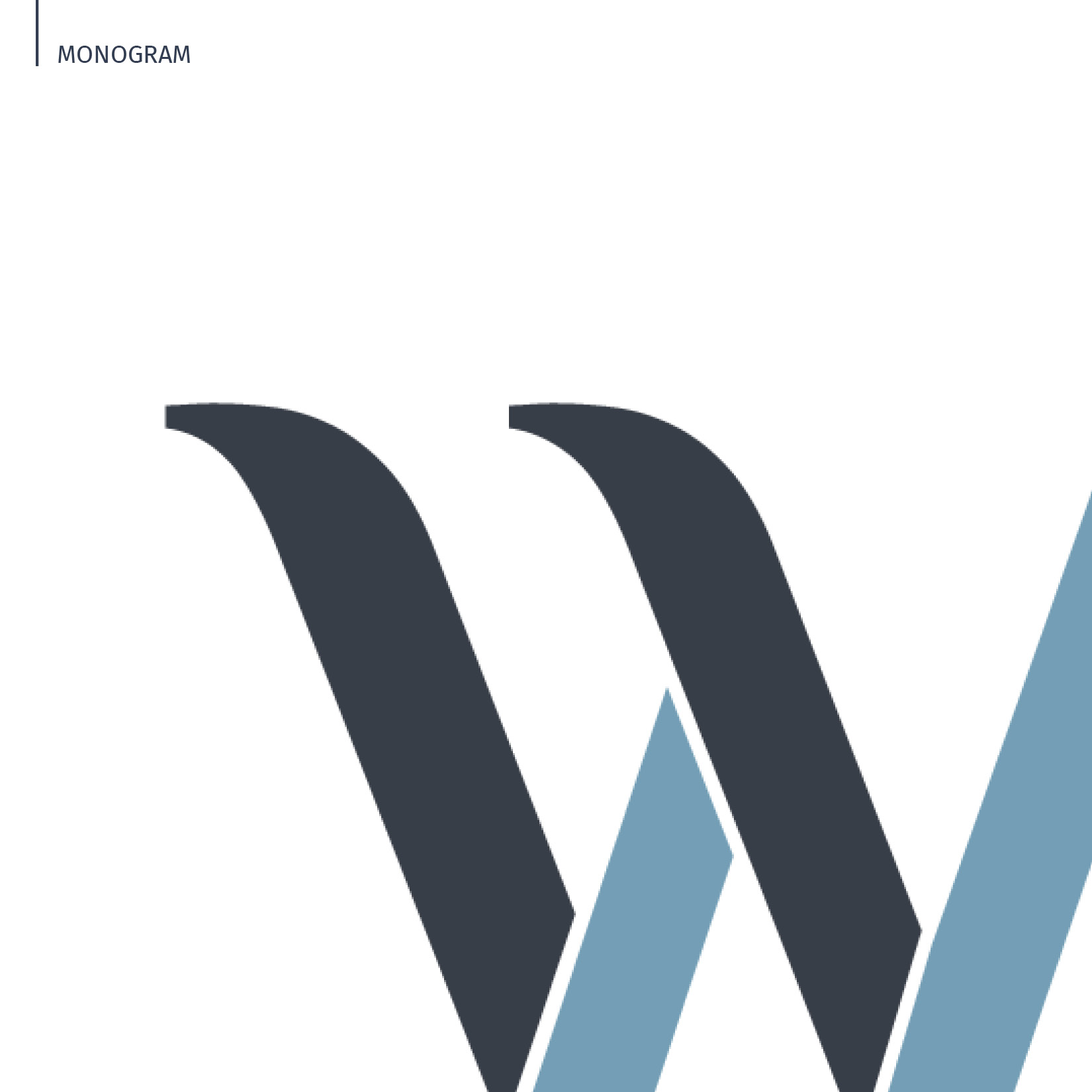
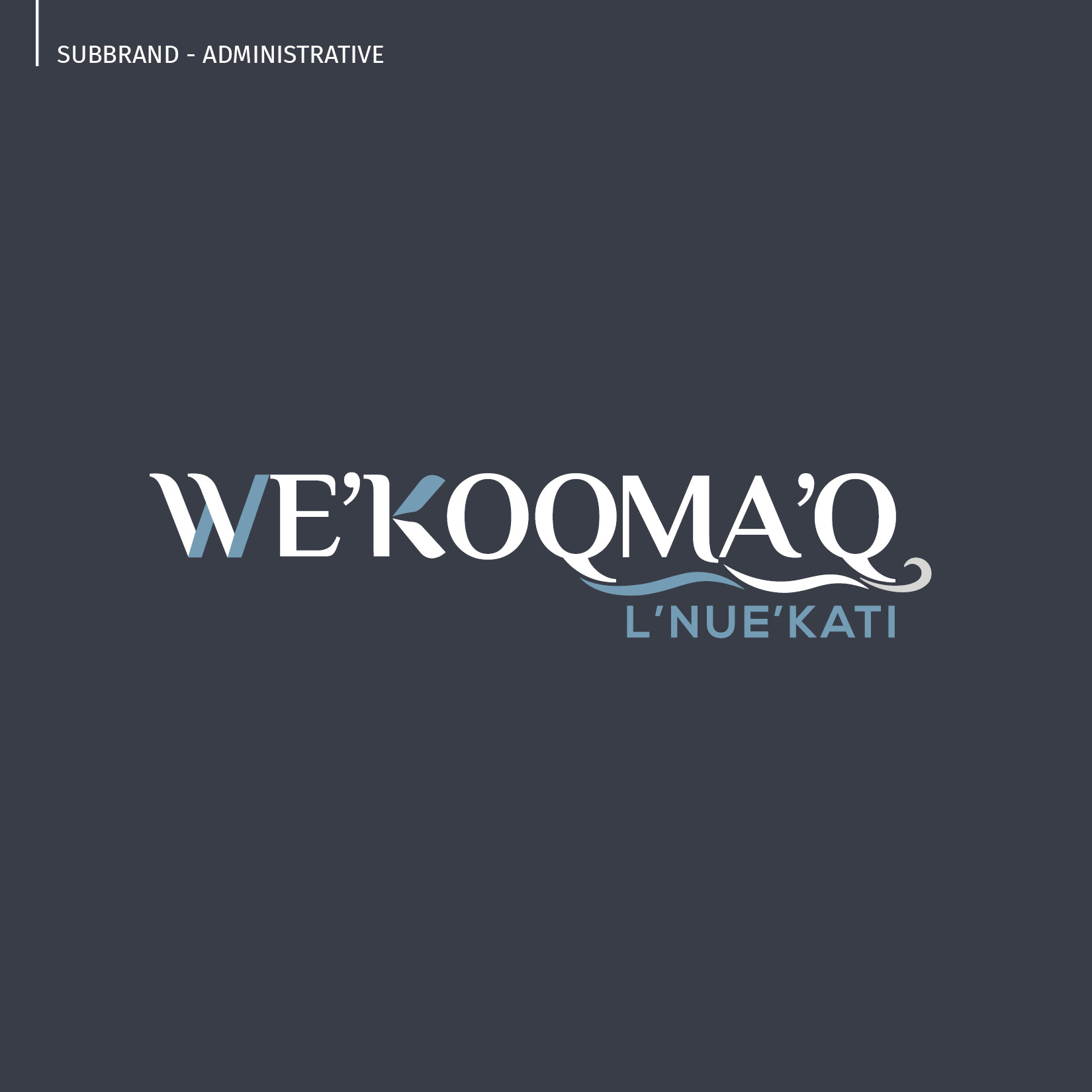
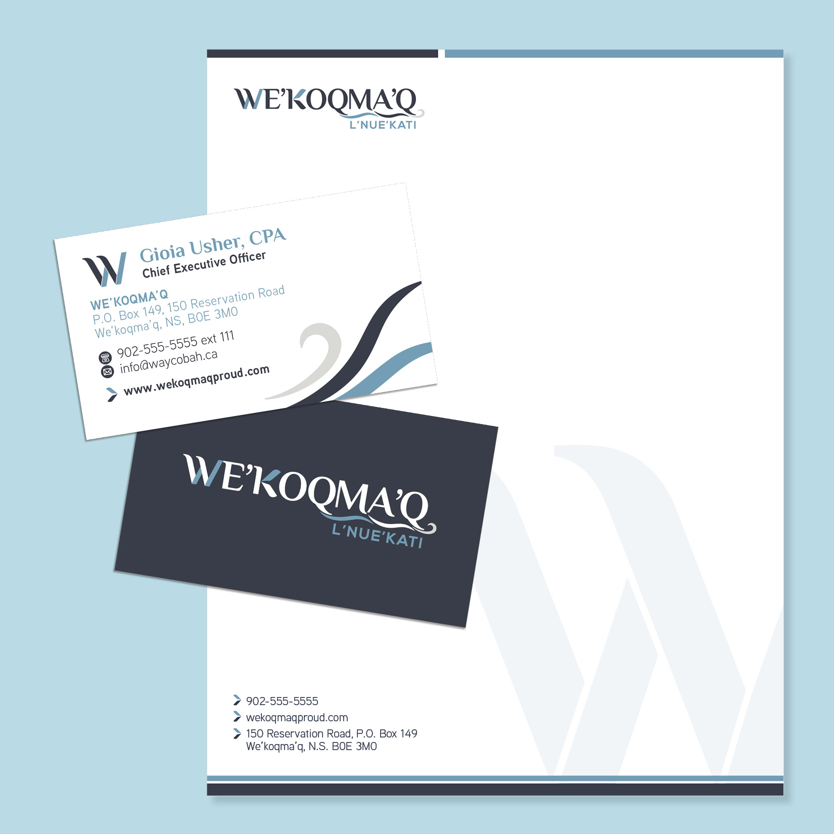
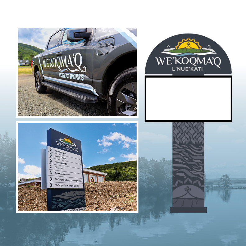
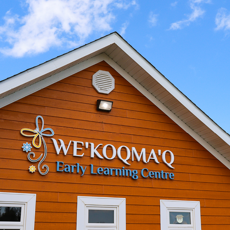
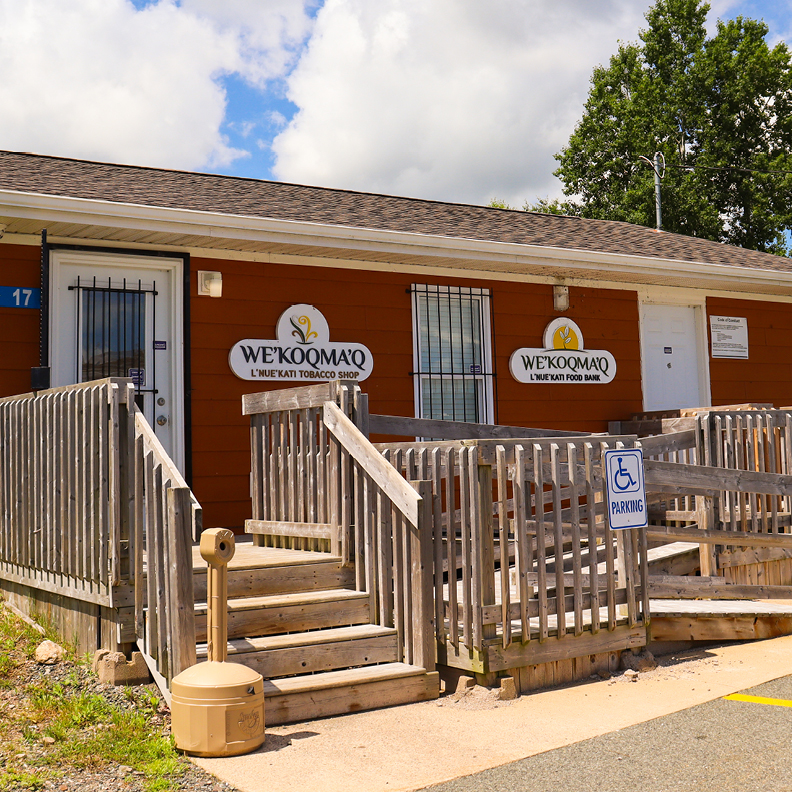
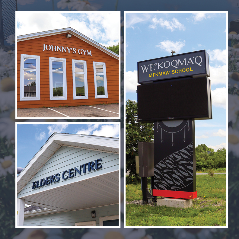
The subbrand for the administration features a stylized ‘W’ and paired down curved line work pulled from the water and fog from the original brand, while including a periwinkle within the K of the typography.
This project took about twelves months to complete from start to launch and every step of the piece was important, intentional, exciting and a learning lesson for our team. We’re very proud of the logo that is now designed and launched and so is the community. It has been well received and we know that it will have a lasting impact for many generations to come.
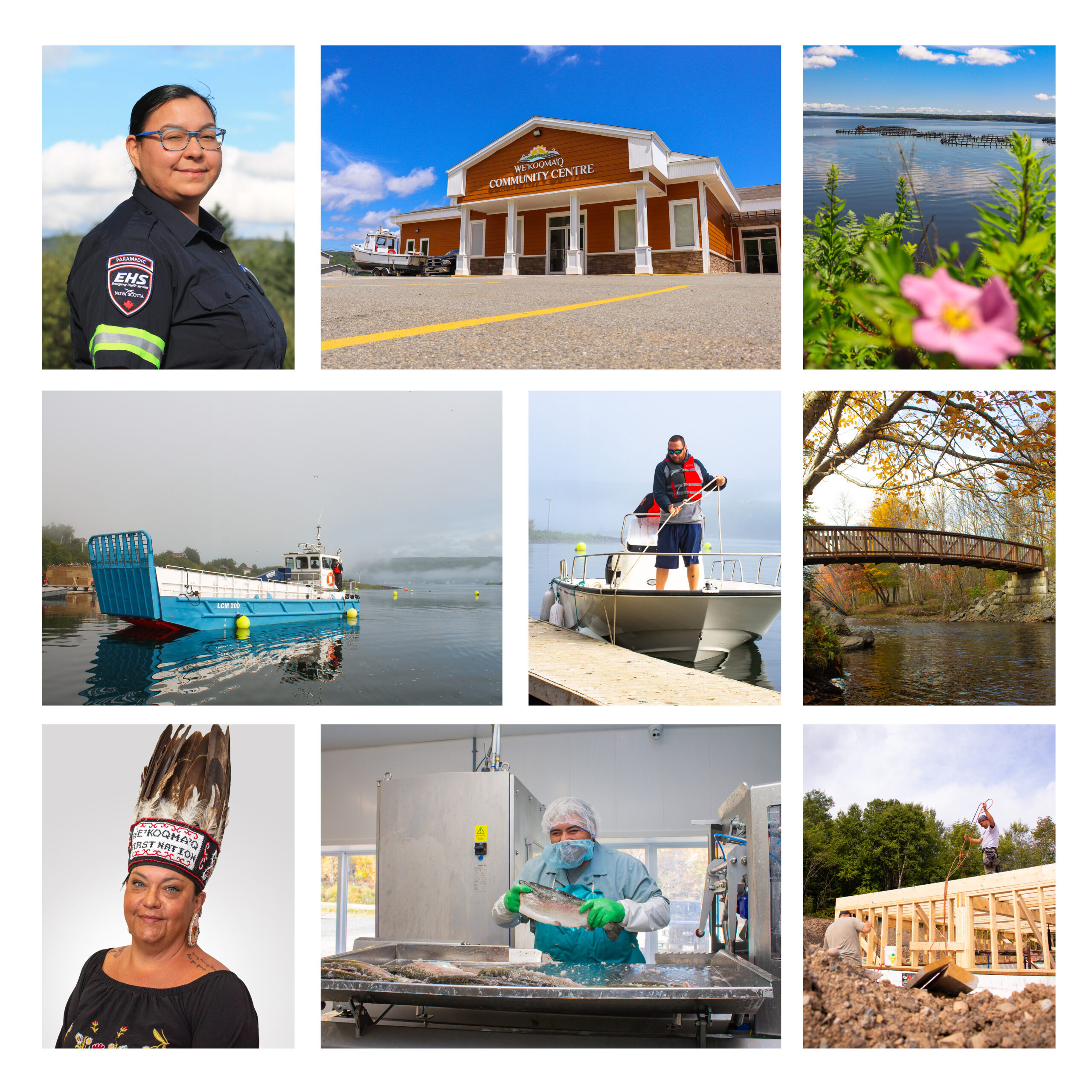
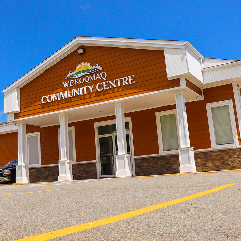
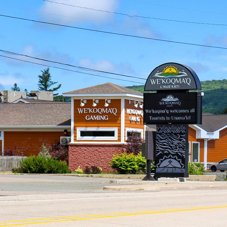
Beyond this project, we’ve provided photography services on a quarterly basis, covering everything from aestetic landscapes to commercial operations and headshots. These photos are used for their website, social media and beyond.
February 11, 2025