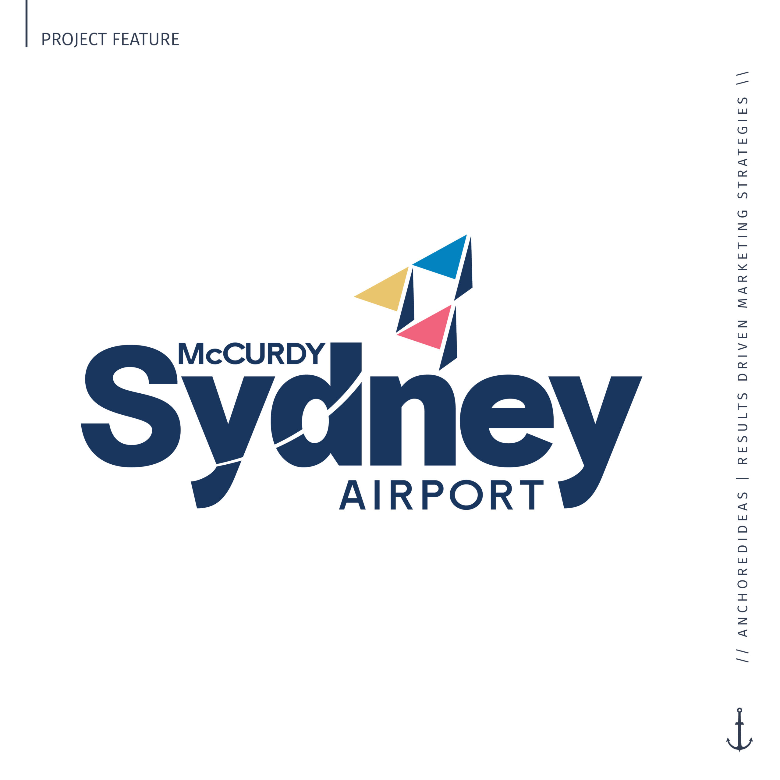
McCurdy Sydney Airport
BRAND DESIGN
J.A. Douglas McCurdy Sydney Airport’s transformational new route announcement comes with a fresh new brand that we had the pleasure of creating!
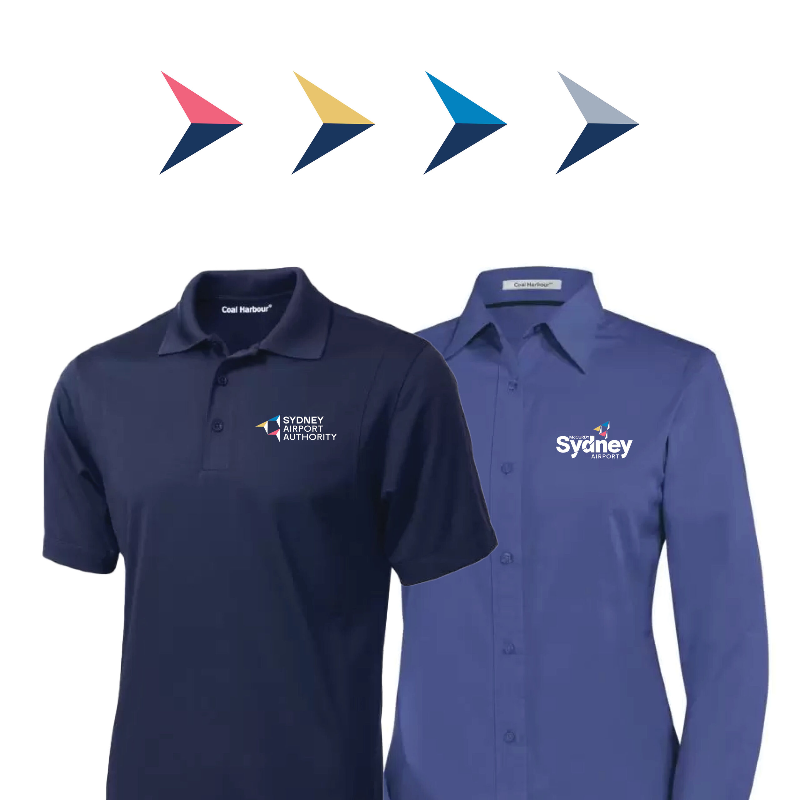
Our team collaborated with the Sydney Airport team to develop a brand that captures the spirit of growth and the bright future of our Island. In the early stages, we presented two brand concepts. The team ended up loving the concepts so much that they knew they had to use both! Our Creative Lead, Jayme, skillfully married these concepts, crafting a corporate brand for the Airport Authority and a public-facing brand the Sydney Airport.
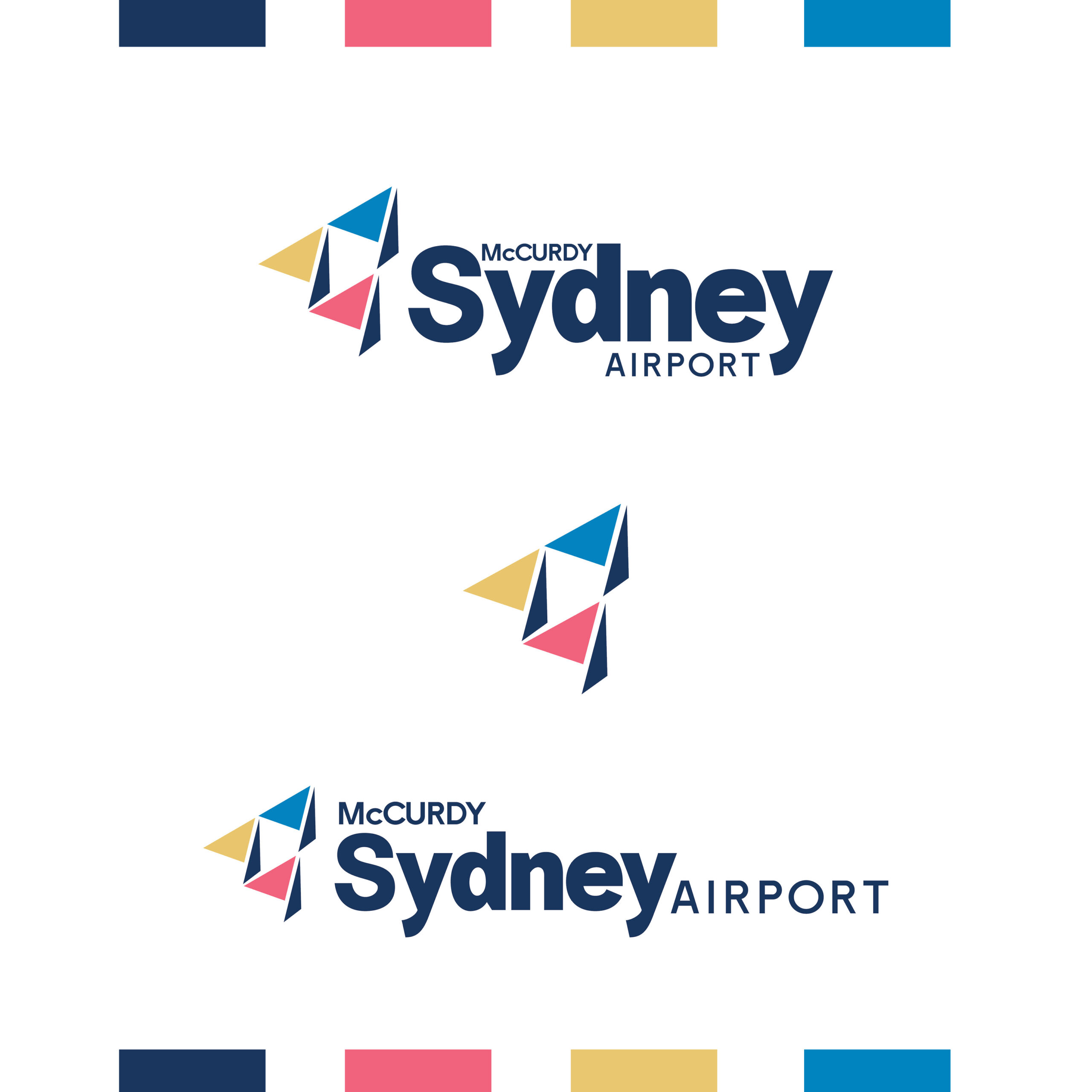
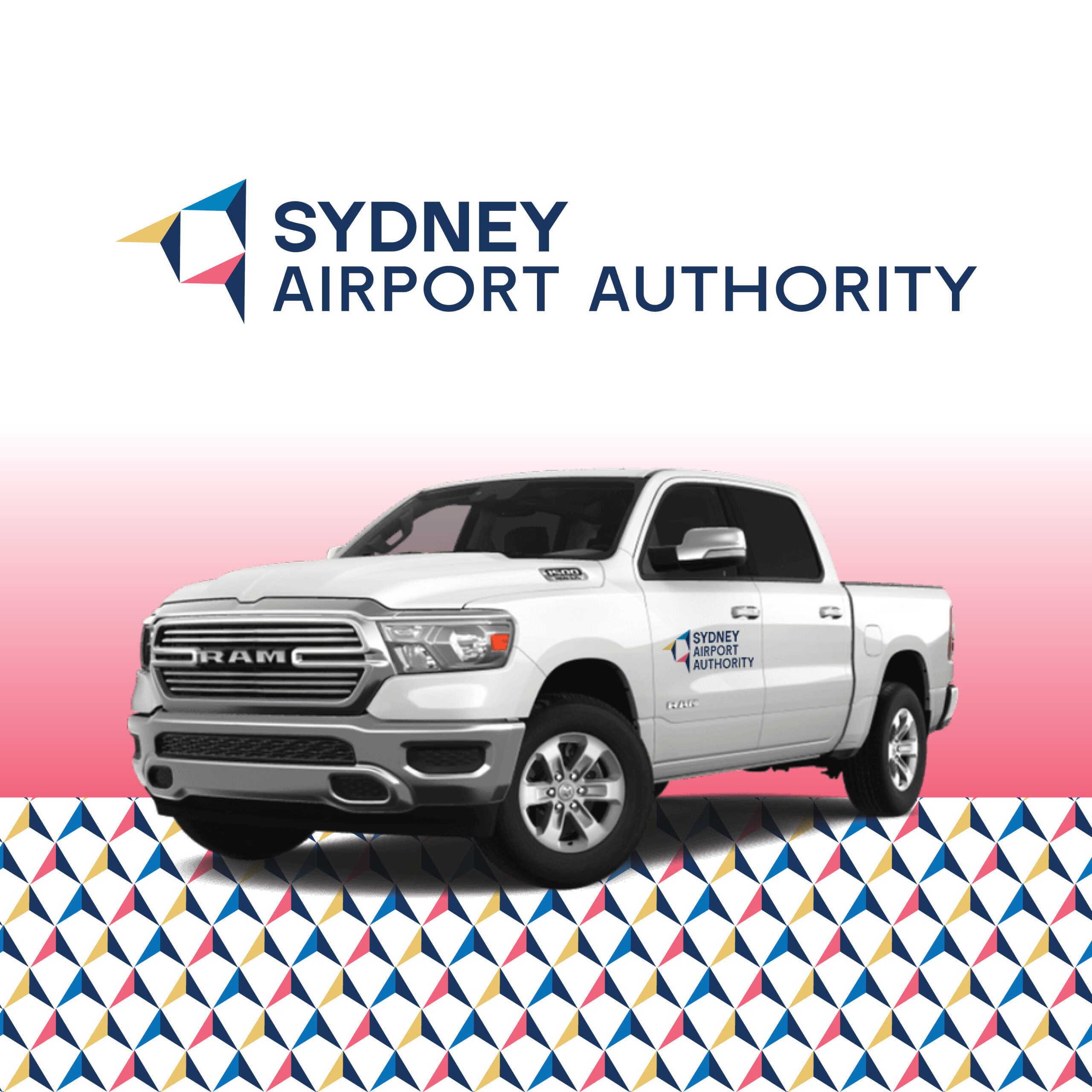
The main icon of both brands is a nod to Alexander Graham Bell. Following the invention of the telephone, Bell began working on tetrahedral kites capable of lifting people into the air. His interest in aviation led him to founding the Aerial Experiment Association, which built the Silver Dart, the plane J.A McCurdy would fly in Baddeck.
In each logo and pattern Jayme created she was consistent in her use of triangles.These triangles tie in the tetrahedral kites to ensure all variations of the brand are cohesive. You can even spot them in the patterns she created!
The direction and placement of the kite not only creates movement, but is representative of forward momentum of their organization. The line through the y and d, symbolizes the string of the kite, but it also ties this forward motion to Sydney.
Finally, the bright, modern and fun color palette was chosen to stand out against other airport brands.
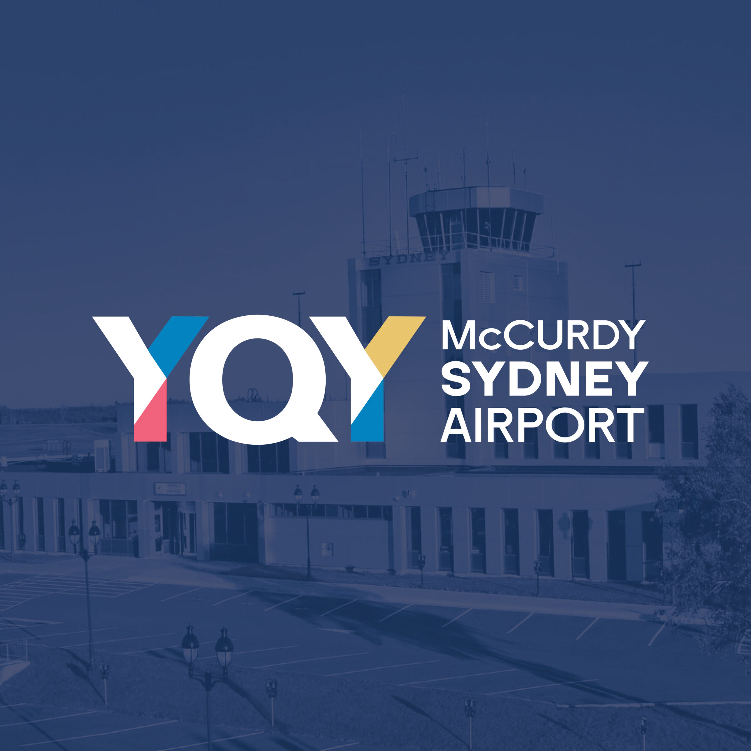
In addition to the two brands, Jayme created the YQY sub-brand, a colorful way to showcase the airport’s geocode.
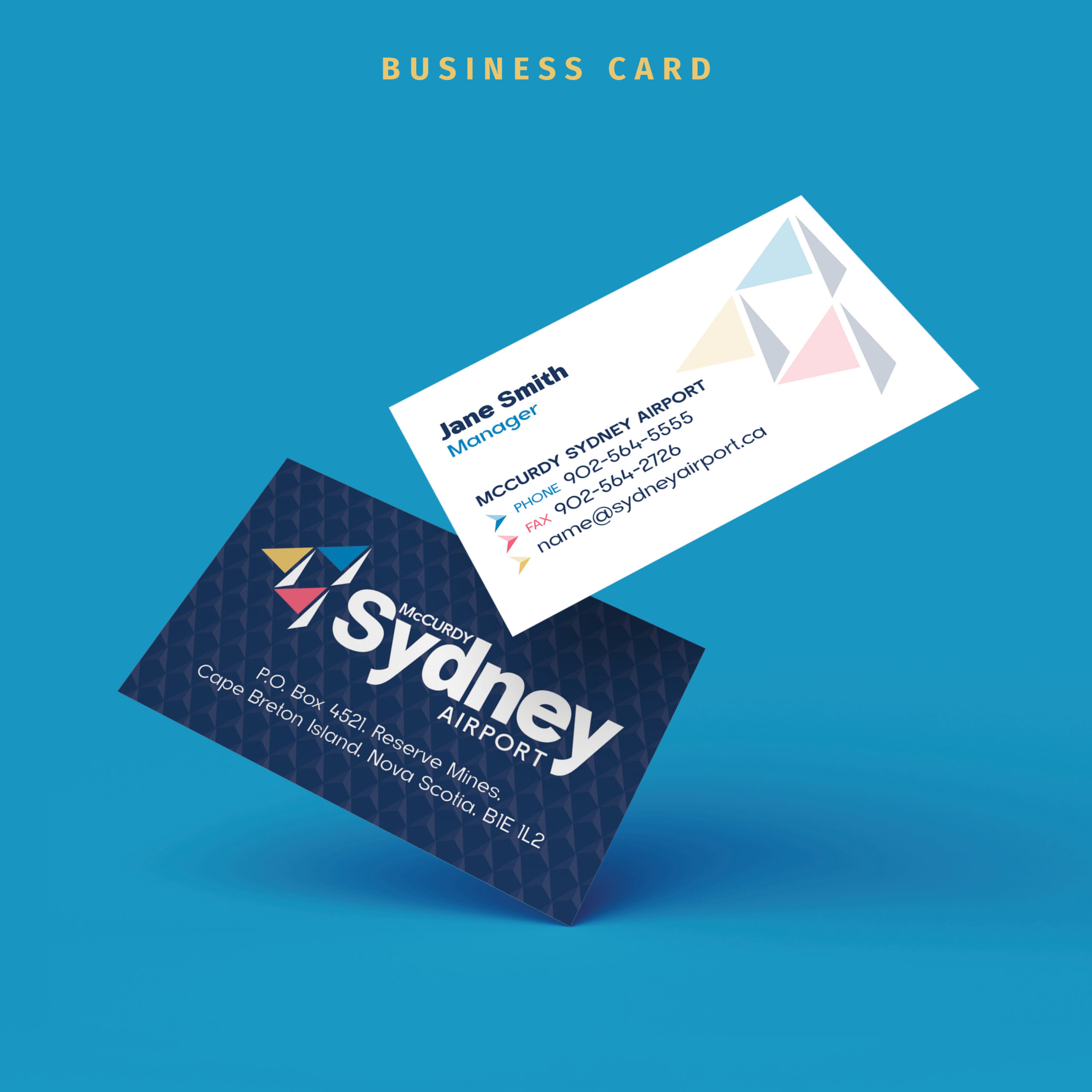
With so many exciting ways to use this brand from stationery, to signage and wayfinding, we can’t wait to see it all come to life. The future’s looking bright for our little Island!
Client:
J.A. McCurdy Airport
Date:
January 16, 2025